
Case study 2016
Krym Trans — Logo and Brand Book
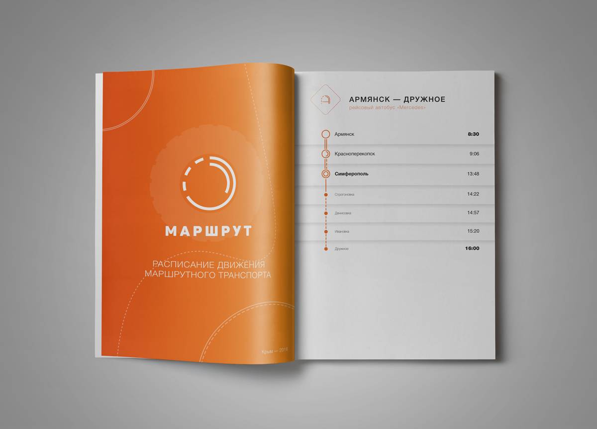
A logo system and brand book for a regional transport operator, built around the color palette and overall direction its team had already chosen.
 Case study
2016
The story behind it.
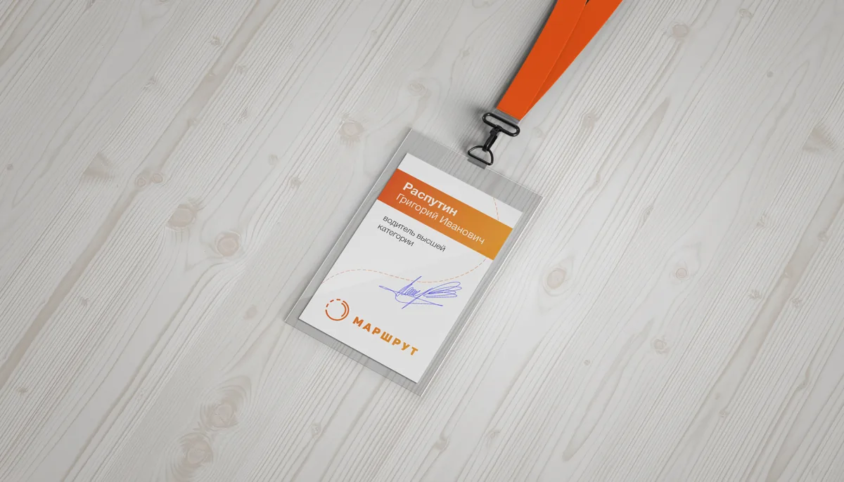
A transport company puts its identity on buses, tickets, timetables and a website, often read at a distance and in a hurry. Krym Trans came to us with a color palette and a general direction already in mind, and asked for a logo and a brand book that would hold it together across every surface.
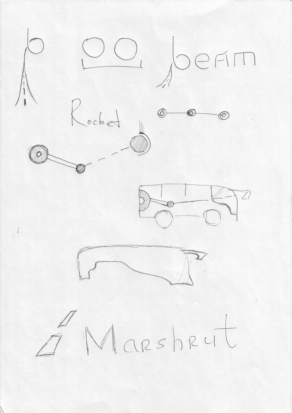
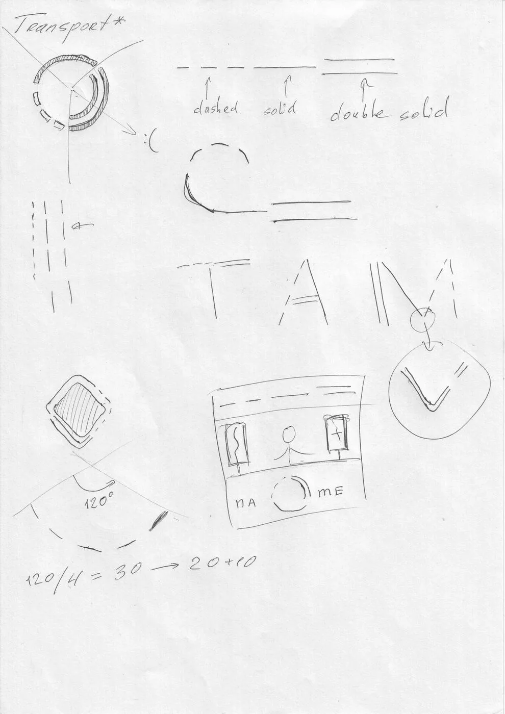
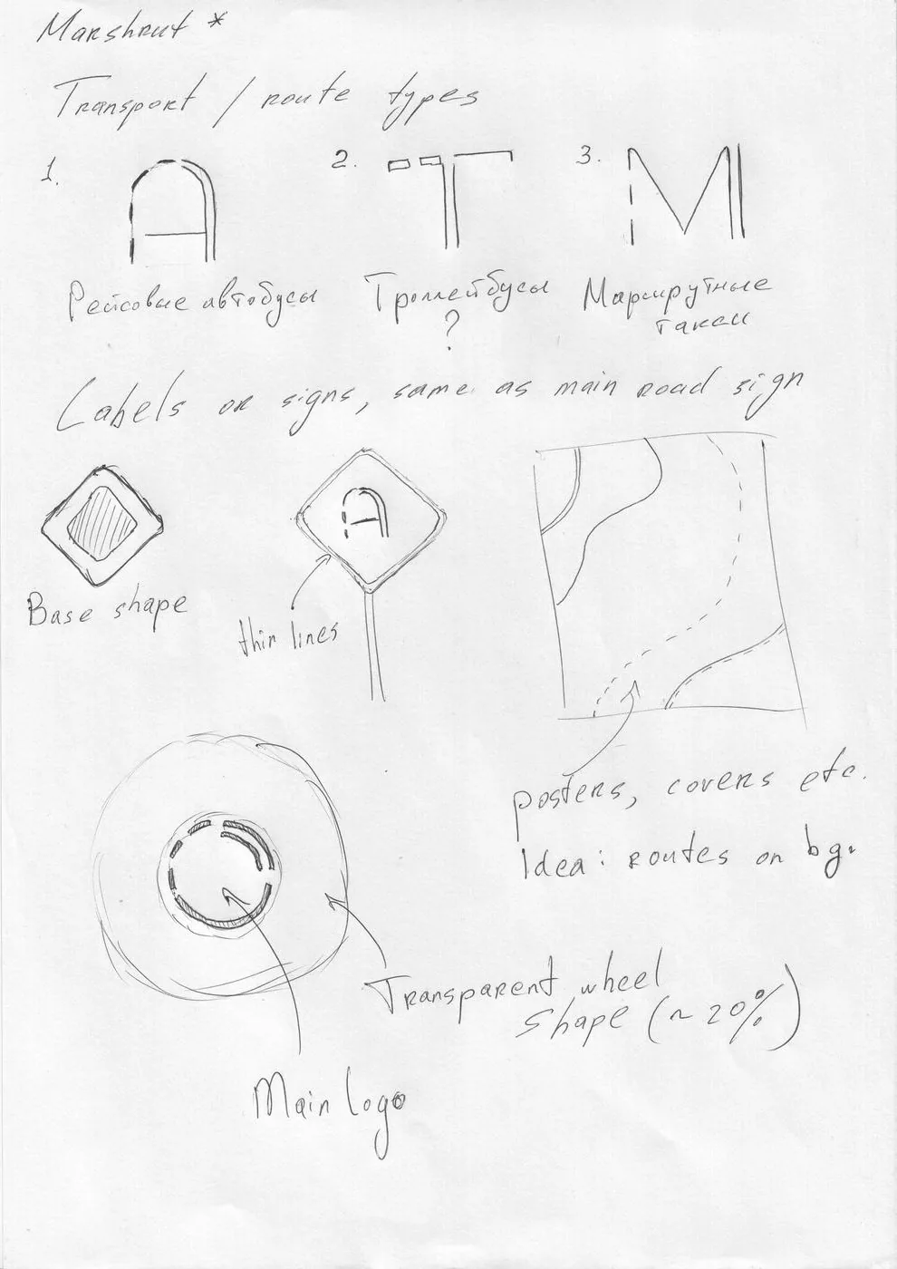
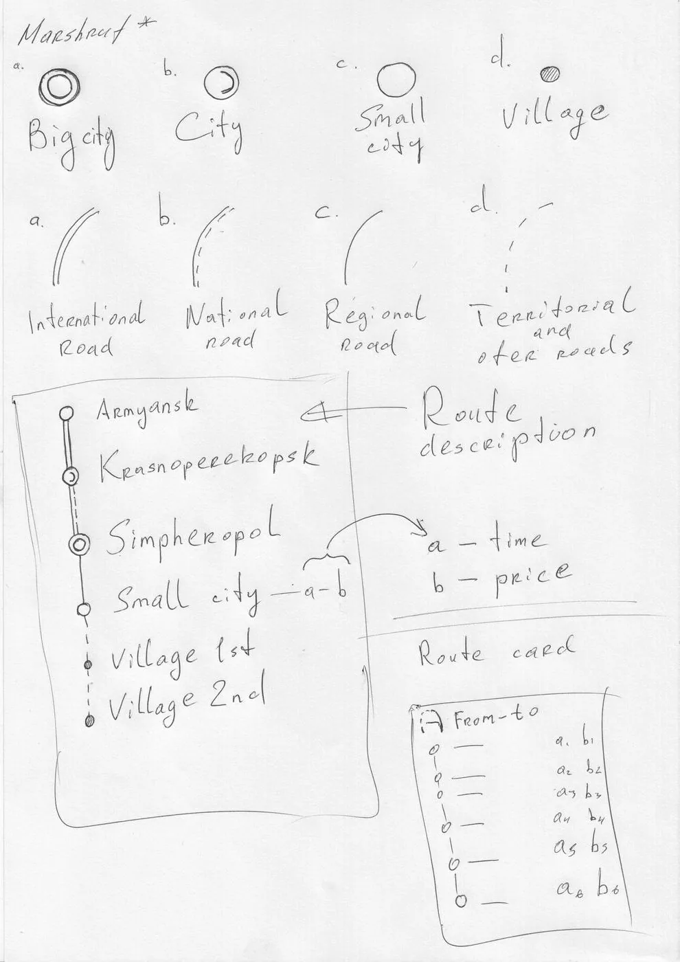
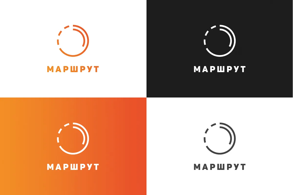
We worked through a series of logo sketches rather than a single proposal, each testing how the mark would read on a vehicle, a ticket and a sign. The client's preferences on color and concept shaped every round, and the final direction kept the palette they had chosen while giving the mark a structure that survives small sizes and single-color print.
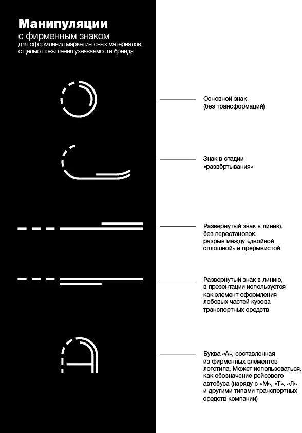
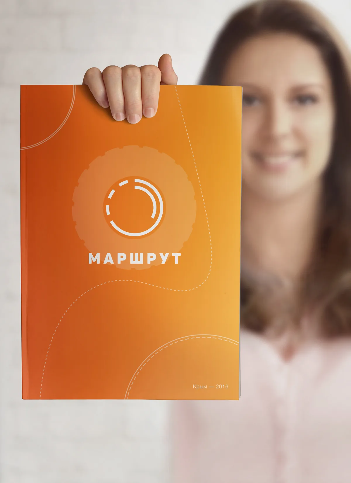
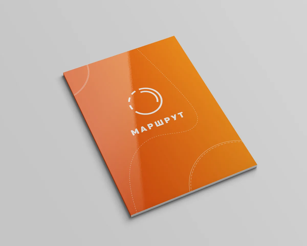
The brand book documents the chosen mark, its clear space, and the rules for type, color and layout — enough for a signage supplier or an outside designer to apply the identity without checking back with us. Every option was drawn in Adobe Photoshop and prepared for both print and screen.
- Client
- Krym Trans
- Frameworks
- Figma, Illustrator
- Skills
- Brand strategy, Logo design, Art direction
- Category
- Product Design Brand Identity
- Created
- 2016



 Up next
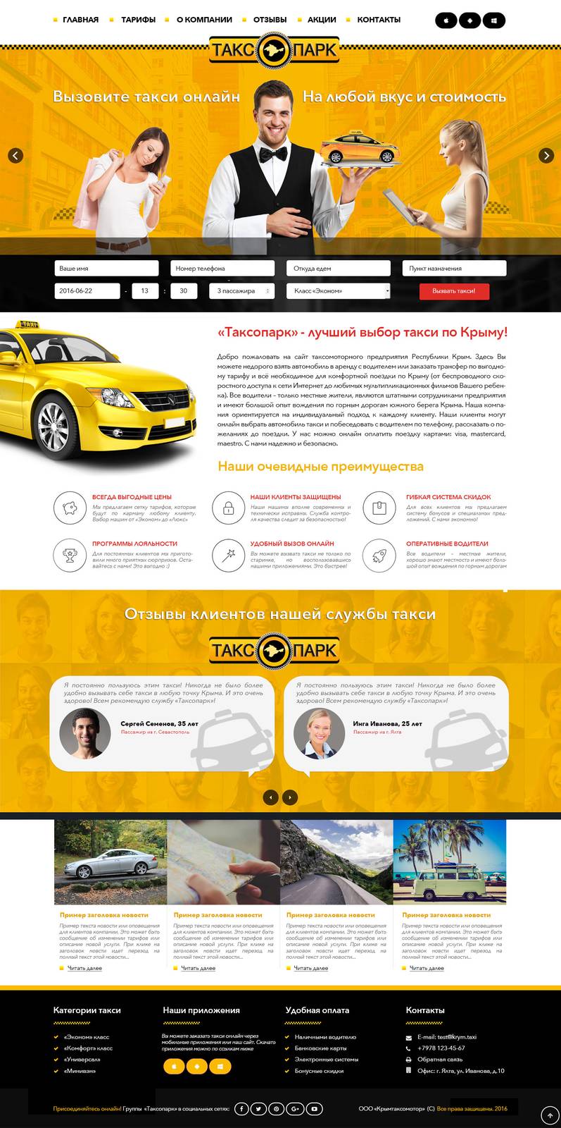
Taxi Site Concepts for Taxopark
View case study
Have a similar project in mind?
Tell us what you are building. We will come back with a plan, a timeline and a straight answer.
Start a conversation