
Case study 2016
Taxi Site Concepts for Taxopark
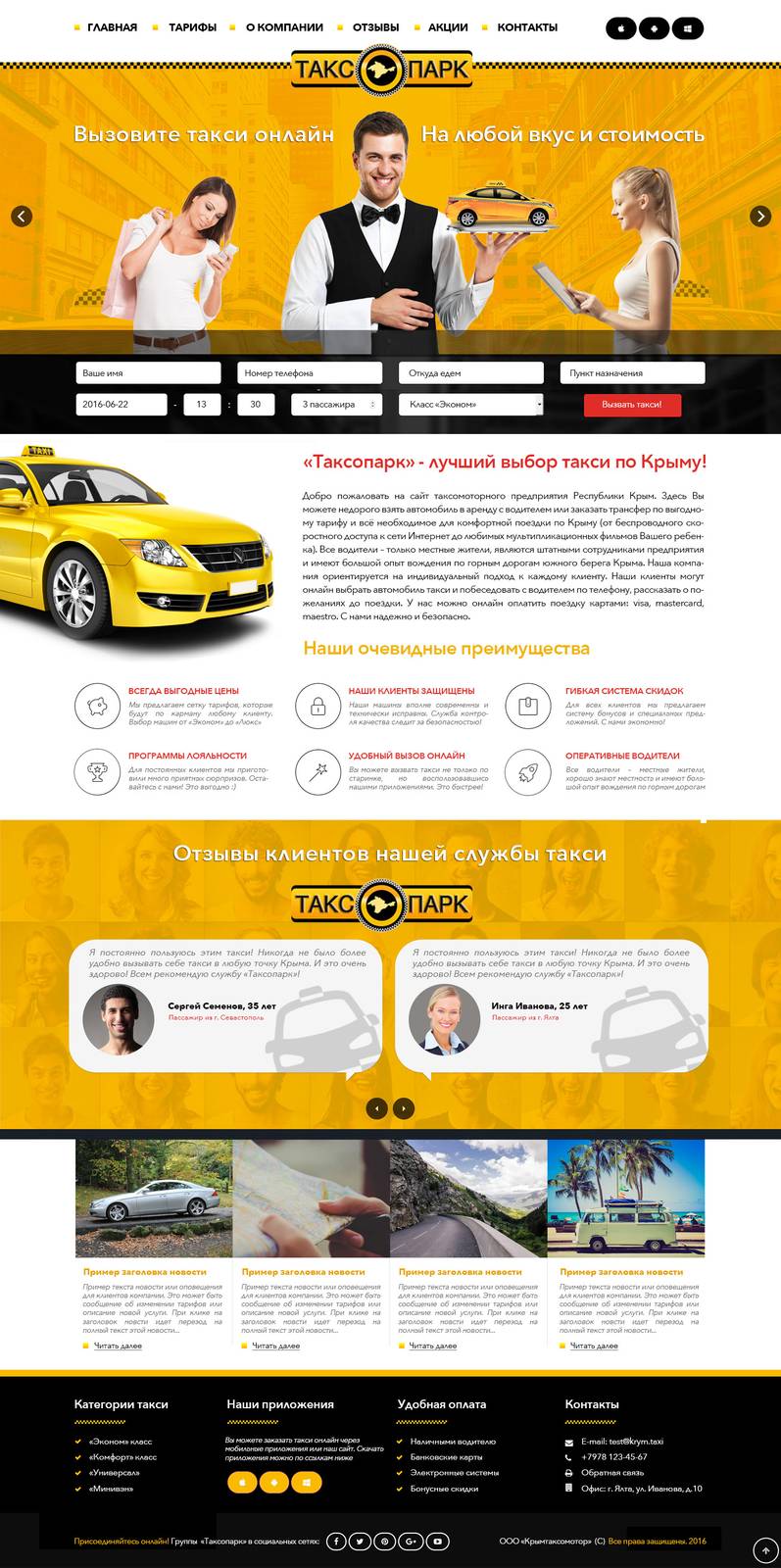
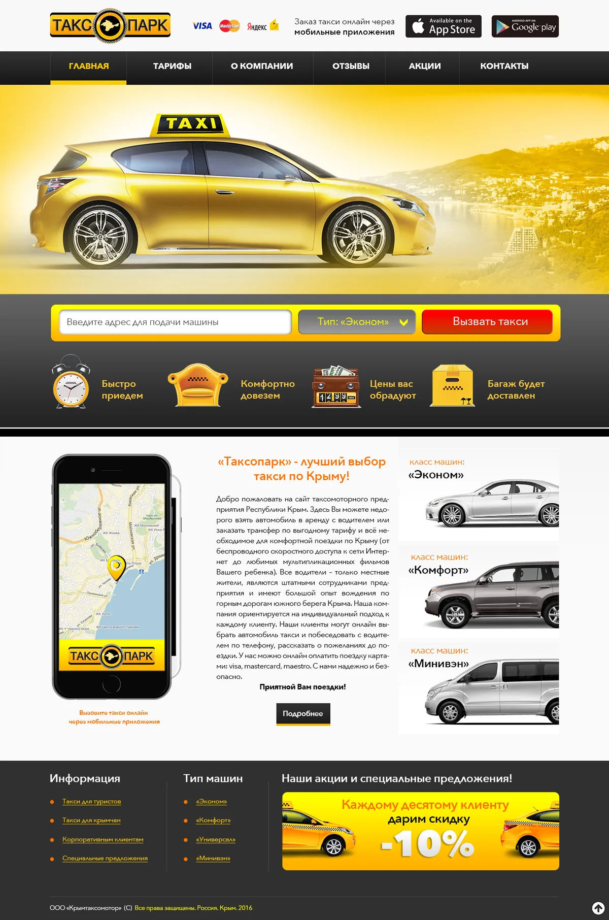
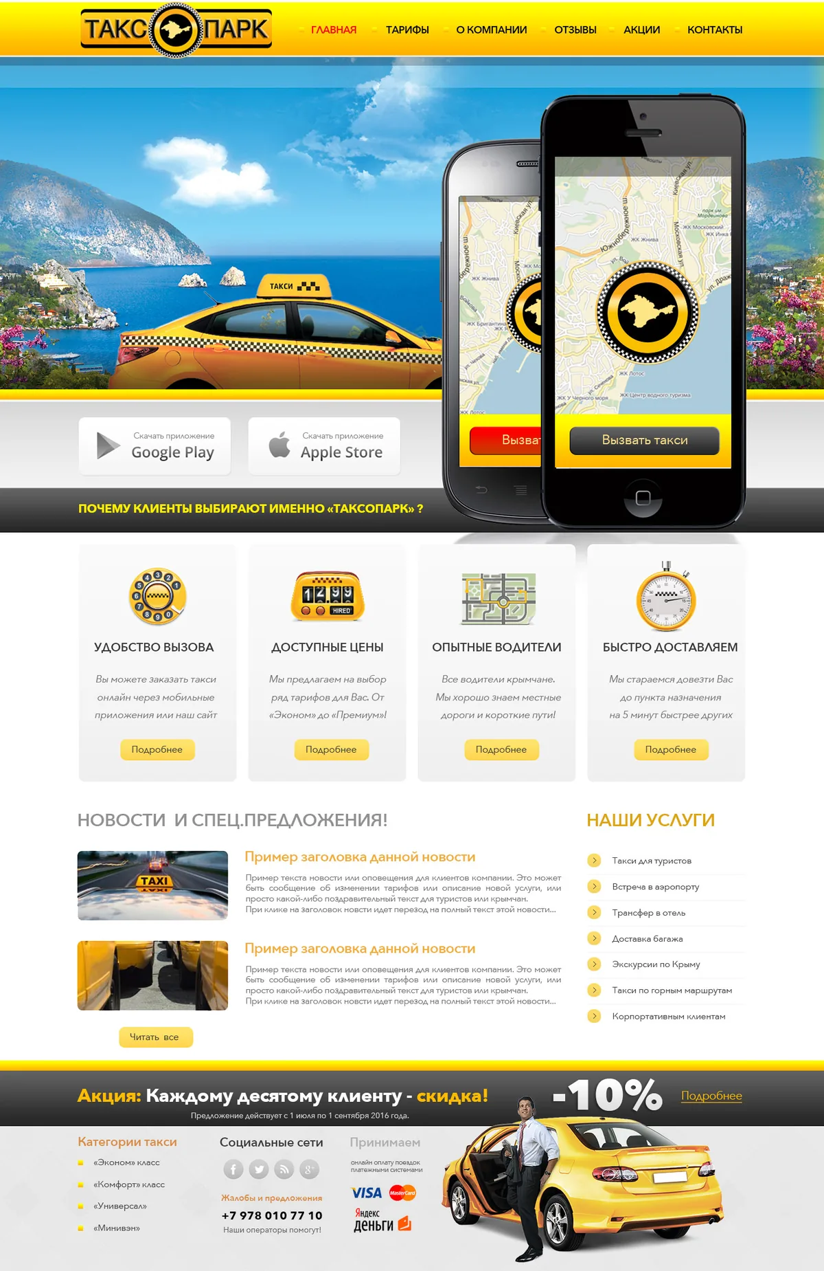
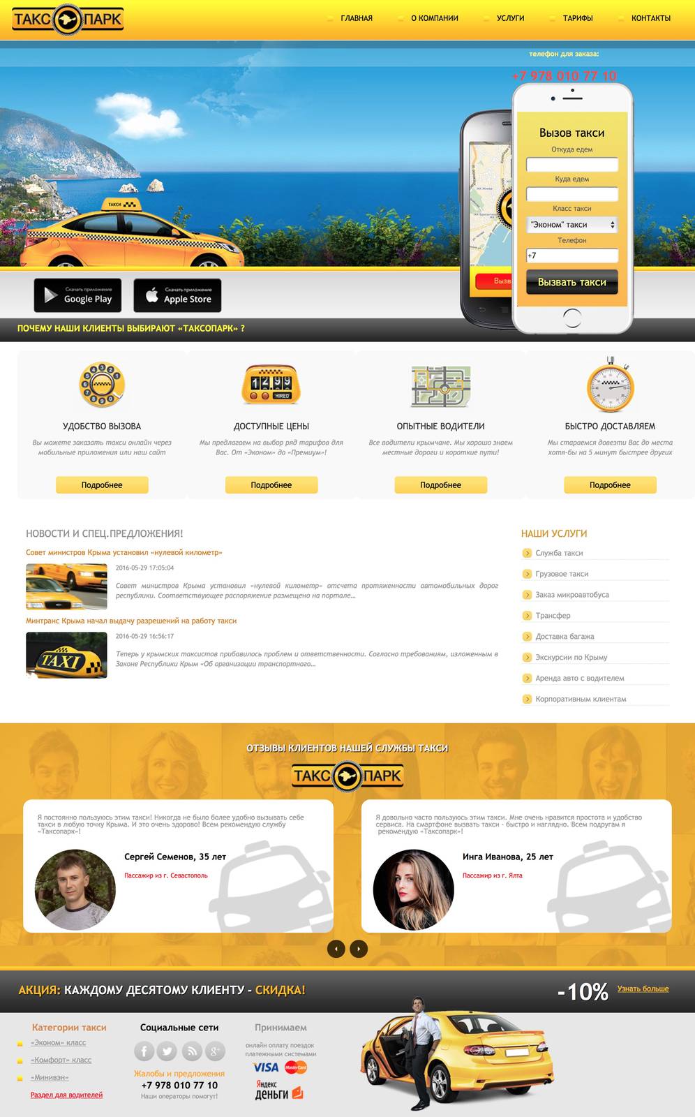
Several full-page design directions for the Taxopark website, drawn as sketches so the client could weigh layout, tone and hierarchy before any code.
 Case study
2016
The story behind it.
Before a taxi site gets built, someone has to decide what the first screen says. For Taxopark we drew a set of full-page design sketches, each taking a different position on how the service should present itself: the order form, the fare information and the brand's color.
Each direction was drawn at page scale rather than as a pile of components, so the client could read the whole page at once and judge the hierarchy the way a visitor would. The sketches covered the home screen, the order flow and the blocks that carry rates and service area.
Adobe Photoshop carried the drawing work, which kept the rounds quick: a direction could change its palette or its layout between reviews without anything being rebuilt. The strongest direction became the basis for the site build that followed.
- Client
- Taxopark
- Frameworks
- Figma, Adobe Photoshop
- Skills
- UI/UX design, Prototyping, Visual design
- Category
- Product Design
- Created
- 2016
 Up next
Taxopark — Online Taxi Booking Site
View case study
Have a similar project in mind?
Tell us what you are building. We will come back with a plan, a timeline and a straight answer.
Start a conversation