
Case study 2019
Verde Taqueria — Delivery App & Brand
A delivery app and brand system that keep a taqueria's food, packaging and identity intact once the order leaves the counter.
 Case study
2019
The story behind it.
A taqueria's food travels badly and its brand usually travels worse. Verde Taqueria wanted delivery that still felt like the restaurant, so we treated the identity and the ordering app as one project rather than two.
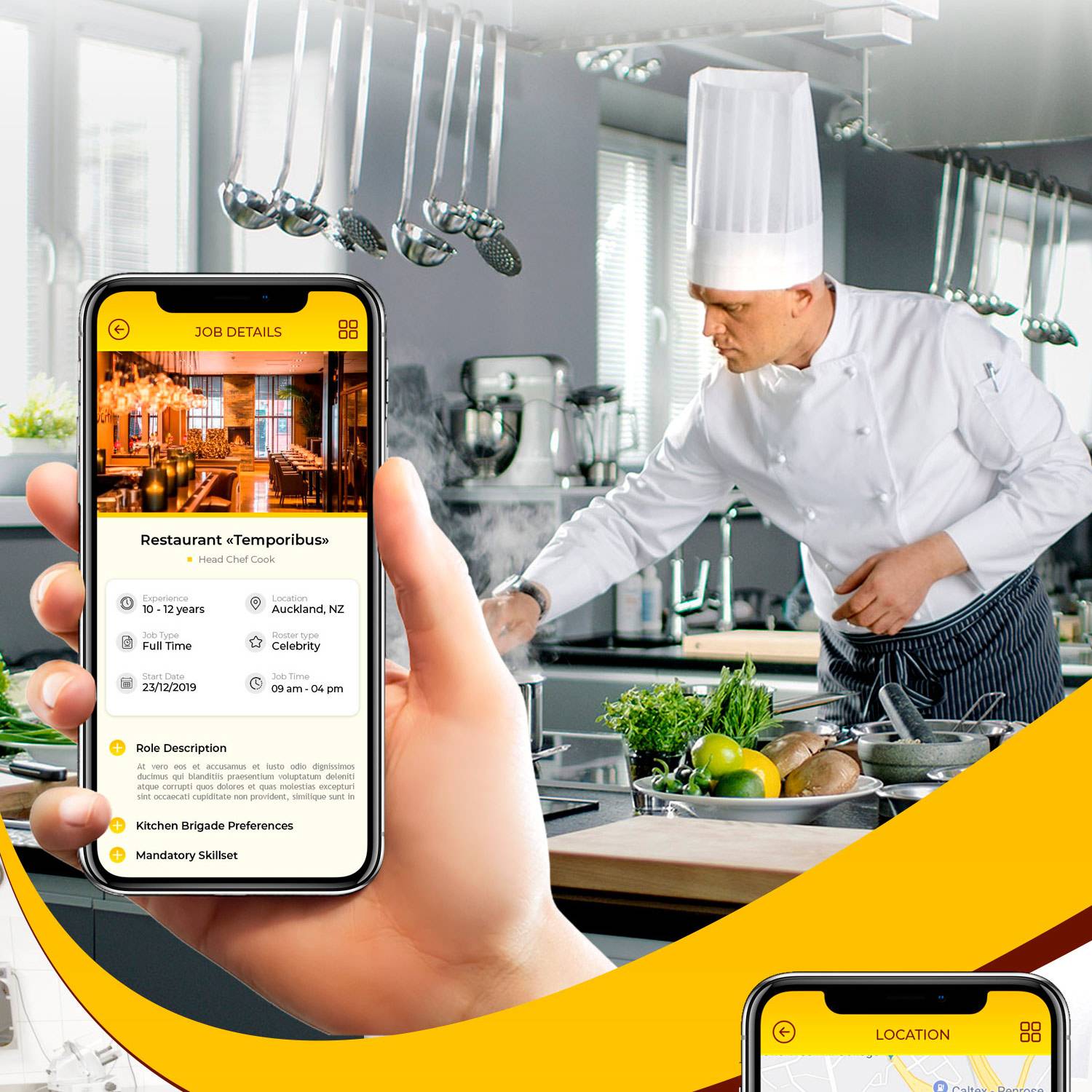
The app leads with a short menu grouped the way the kitchen actually builds an order — tacos, sides, drinks — and a cart that makes the extras obvious without slowing checkout. Tracking stays on one screen: where the order is, how long it will take and a direct line to the restaurant if something goes wrong.
The brand work covered a wordmark, a warm two-tone palette and packaging marks that hold up on a delivery bag. Menu cards and app screens share the same grid, so the food looks the same in the app as it does on the counter.
- Client
- Verde Taqueria
- Frameworks
- Figma, Illustrator
- Skills
- Photoshop, Figma
- Category
- Product Design Brand Identity
- Created
- 2019
Inside the product.
A closer look at the interface, flows and details behind the launch.
1 screens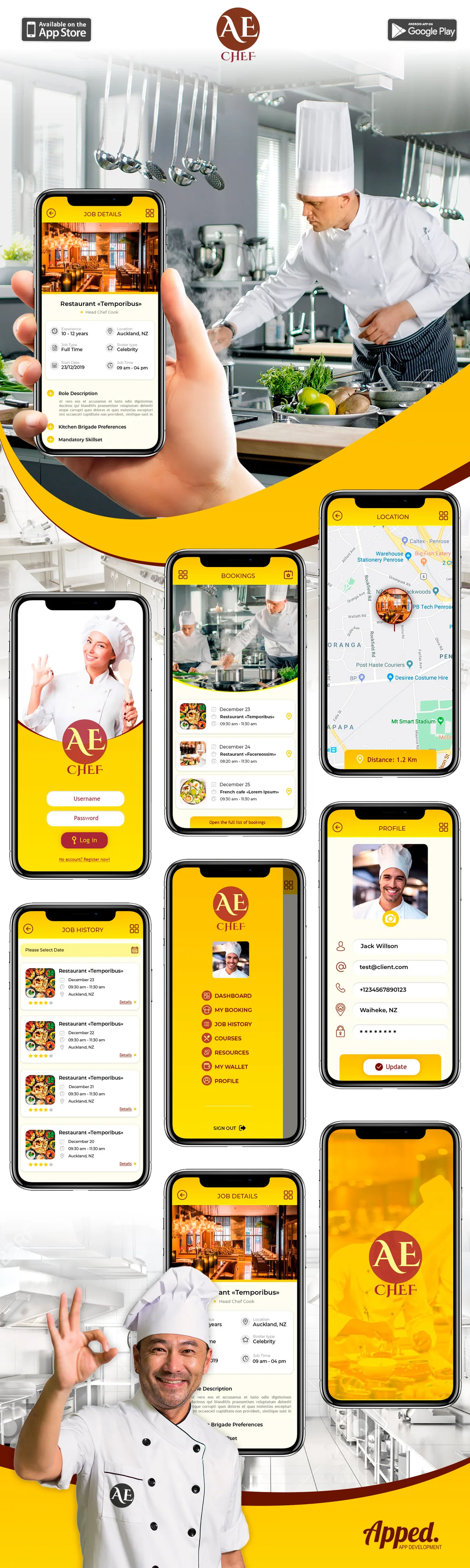
 Up next
ABU Foundation — Financial Services Website
View case study
Have a similar project in mind?
Tell us what you are building. We will come back with a plan, a timeline and a straight answer.
Start a conversation