
Case study 2020
La Cour — Bistro Menu and Checkout
Menu browsing, card checkout, and order tracking for a European bistro, designed to read well on a tablet and finish fast on a phone.
 Case study
2020
The story behind it.
A bistro menu rewards a slow read, while an order needs to move. La Cour's app holds both: menu screens with room for the dishes, and a checkout short enough to finish on a phone. The design was built for a European kitchen in New Zealand, with a full set of screens covering the order cycle.
Guests browse by section, add dishes to a running order, and adjust quantity or notes before paying. The total stays in view while the order changes, and card payment is handled in the same flow, with confirmation states designed for a small screen.
Once the order is placed, a status view tracks preparation and readiness, so guests can time the next course or the walk back to the restaurant. Tablet and phone layouts share one visual system, which kept the menu, cart, and status screens consistent without a second design pass.
- Client
- La Cour
- Frameworks
- Figma, Adobe Photoshop
- Skills
- UI/UX design, Prototyping, Visual design
- Category
- Product Design
- Created
- 2020
Inside the product.
A closer look at the interface, flows and details behind the launch.
1 screens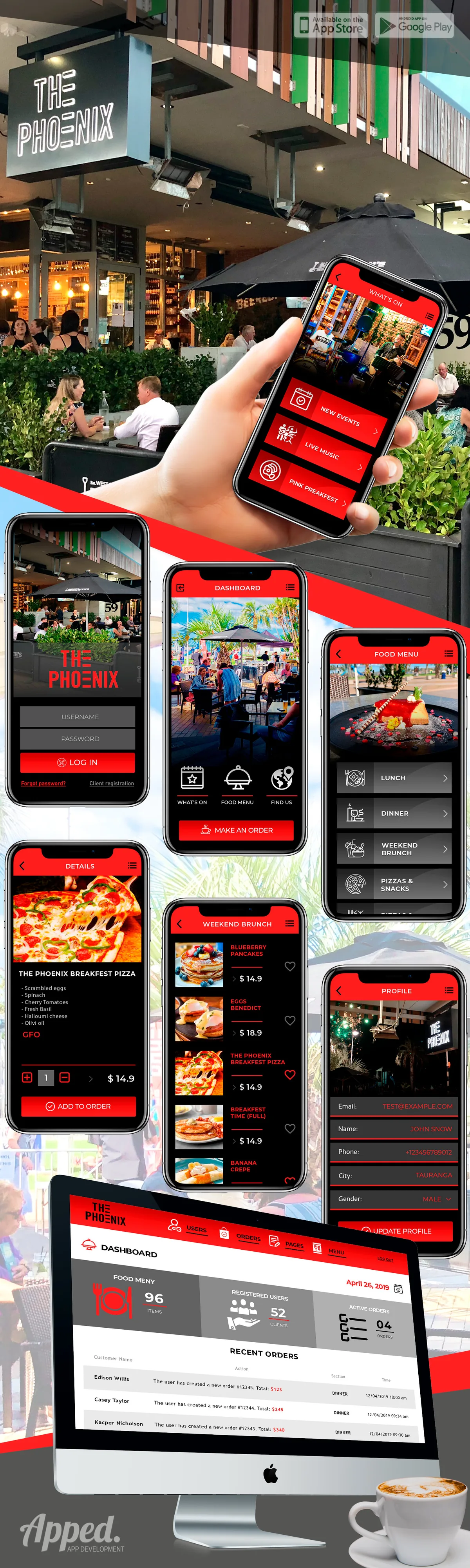
 Up next
Bright Nest — Children's Center Finder
View case study
Have a similar project in mind?
Tell us what you are building. We will come back with a plan, a timeline and a straight answer.
Start a conversation